Neon Sign Fonts and Typography
A neon sign font is the typeface that shapes the words of your sign, chosen for how it looks, how clearly it reads, and how well it can be formed into a glowing tube. The best neon fonts share a few traits: an even, medium-to-bold stroke, clear letter shapes, and enough spacing that the glow does not merge. Monoline scripts and clean sans-serifs are reliable choices, but the right font depends on your message and where the sign will hang. This page is part of our guide to custom neon sign design, and it covers what makes a font work in neon, the main font styles, what glass and LED can each bend, readability, matching a font to your message, how font choice affects size and cost, and using your own logo. Echo’s neon generator gives you 28 fonts to preview live, so you can see your exact words before you order.

What Makes a Font Work in Neon
A neon sign is one continuous tube of light, and that single fact drives every good font choice. Whether the tube is hand-bent glass or LED flex, it has a real, fixed width, so the letters cannot be hair-thin the way printed type can. Fonts with an even, medium-to-bold stroke glow evenly and read cleanly. Fonts with very thin strokes, tight junctions, or crowded letters run into trouble once they light up: thin lines fade out at a distance, and letters packed too close bleed together, so an O fills into a solid circle and an M turns into a glowing blob. Two qualities matter most. A consistent stroke weight, often called monoline, keeps the glow the same brightness from the start of a letter to the end. Open letter shapes with generous spacing keep each character distinct. Get those two right, and almost any style can work in neon.
Font Styles for Neon Signs
Echo’s neon generator offers 28 fonts, and they fall into a handful of styles, each with its own personality. The main styles are the following:
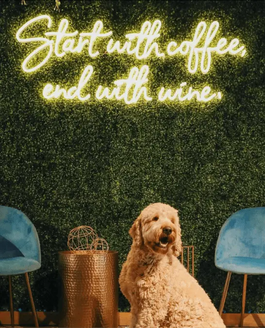
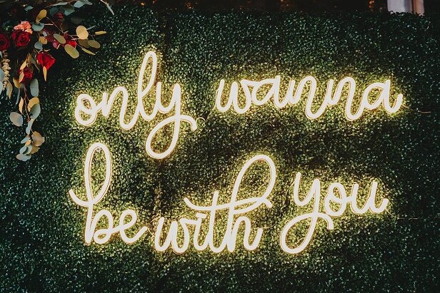
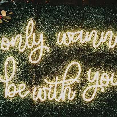
- Script and cursive: flowing, connected letters that feel warm and personal. The most popular choice for names, weddings, and home decor.
- Monoline: a single even-weight line with no thick-and-thin contrast. Clean, modern, and about as native to neon as a font gets.
- Sans-serif: simple block letters with no feet. Highly legible and modern, a favorite for business names and clear messages.
- Serif: letters with small feet at the ends. Refined and traditional, and the rarest style in neon, best kept to larger signs.
- Display and block: bold, high-impact lettering built to be read from across a room. Strong for storefronts, bars, and gyms.
- Double-line: an outlined style that traces the classic look of old tube signage. Great for a retro, vintage feel.
Preview your words in each style before you decide, because a font that looks right for one word can feel wrong for another.
Glass Neon vs LED Neon: What Each Format Can Bend
Glass and LED neon shape letters differently, and that changes which fonts each one handles best. A glass neon sign is hand-bent from a single continuous tube over a flame, so connected scripts and monoline styles are its natural form, the same flowing shapes neon has always been made from. Very tight serifs, hairline details, and complex junctions are hard or impossible to bend in glass, so glass rewards simpler, continuous letterforms. You can see the craft behind this in our guide on how glass neon signs are made. An LED neon sign traces each stroke with flexible tubing on a backboard, so it handles the same connected styles beautifully and tolerates slightly more geometric or angular shapes. Either way, the rules from the last section hold: even strokes and open shapes win, in both formats.
Readability: Stroke, Spacing, and Size
Readability decides whether your sign works, no matter how good the font looks on screen. Keep the stroke medium-to-bold, since thin strokes lose brightness and can vanish from across a room. Give the letters room to breathe, because tight spacing makes the glow of neighboring letters merge. Script needs extra care here: its connected loops want more size and space than block letters to stay clear, so script tends to work best on larger signs and shorter phrases. Use all capitals only for short words, and keep longer messages in title case so the shapes stay easy to read. Size the text to how far away people will read it: a font that looks great on a 40 inch sign can be unreadable at 12 inches. A quick test helps: preview your design at full size, then step back and squint. If the letters blur together or a loop closes up, choose a cleaner font, add spacing, or size up. For a full breakdown of how big your sign should be, see our guide on what size neon sign do you need.
Matching the Font to Your Message
The right font sends the right feeling before anyone reads a word. Match the style to the message and the space:
- Names, weddings, proposals, and home decor: script or cursive, for warmth and personality.
- Business names, offices, and modern interiors: sans-serif, for a clean, professional look.
- Storefronts, bars, gyms, and event signs: bold display or block, so the words carry across a room.
- Luxury, heritage, or vintage settings: serif or double-line, for a refined or retro feel.
Color plays into this too, since a soft script often suits softer colors while a bold block font can carry brighter ones. Our guide to neon sign colors covers how to pair the two. When in doubt, keep it to one font, or at most a decorative font for the feature word and a clean one for the rest.
Font, Size, and Cost
Font choice affects more than looks; it affects the size and the price of your sign. At the same width, a flowing script stands taller than block lettering, because its loops and ascenders reach further up and down. Taller letters mean more tubing, and more tubing means more material and more labor to form, so a script sign can cost a little more than a block sign of the same width. Simple single-line and block fonts use less tube and tend to be the most economical. None of this should stop you from choosing the font you love, but it helps to know why two signs of the same width can carry different prices. For how pricing works overall, see our guide on how much neon signs cost.
Using Your Own Logo
If none of the fonts fit your brand, you can bring your own logo. Echo’s generator gives you 28 fonts to choose from, and while you cannot upload your own font file, you can supply your logo or custom artwork and we adapt it into neon. Very fine or highly detailed logos get simplified so they hold up as tubing, keeping the strokes thick enough to glow evenly. This is the route for brand marks, wordmarks, and one-off designs that go beyond the font list. For how logo signs are made and what artwork works best, see our guide on custom logo neon signs.
See Your Words Glowing
The best way to choose is to see your words lit up. Echo’s neon generator lets you type your text, switch between all 28 fonts, and preview colors and sizes in real time, so you can judge readability and style before you order. When you are ready, design your custom neon sign in LED, or build a glass neon sign, and watch your lettering come to life.
Frequently Asked Questions
The best neon font has an even, medium-to-bold stroke and clear, well-spaced letters, so it glows evenly and reads at a glance. Monoline scripts and clean sans-serifs are reliable, but the right choice depends on your message and where the sign will hang.
Yes. Connected script suits neon because a sign is one continuous tube, so the flowing strokes bend cleanly and look authentic. Give script a little more size and spacing so the loops stay open and easy to read.
You can choose from the 28 fonts in Echo’s neon generator, but you cannot upload your own font file. For a specific brand look, you can upload your logo or artwork and we adapt it into neon, simplifying fine details so the design holds up as glowing tubing.
Neon tubing has a real width, so hairline strokes, tight junctions, and crowded letters bleed together once lit. An O can fill into a solid circle. Fonts with even, well-spaced strokes stay crisp.
Glass is hand-bent from one continuous tube, so connected scripts and monoline styles are its natural form, while hairline serifs and fussy details are hard to bend. LED flex traces strokes too and handles slightly more geometry. Both favor even strokes and open shapes.
It can. At the same width, a flowing script is taller and uses more tubing than block lettering, which means more material and labor, so it can cost a little more. Simple single-line fonts use less tube. See the cost guide for details.
Size the text to the viewing distance and keep the strokes from getting too thin. Script usually needs more height than block to stay legible, and small signs read best with simple fonts. Our size guide covers letter height for distance.
Choosing the Font That Fits
Choosing a neon font comes down to a few things: pick an even, well-spaced style, match it to your message, and make sure it reads at the size and distance you need. Script brings warmth, sans-serif brings clarity, display brings impact, and Echo’s 28 fonts cover the range, with a logo upload for anything beyond them. Preview your words before you order, and the font will do exactly what you want once it is glowing. For the rest of the design choices, from color to size, see our full guide to custom neon sign design.