

Butcher Shop, Deli & Market Neon Signs: Storefront, Counter, and Branding Ideas
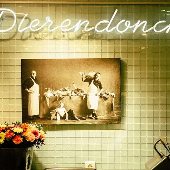
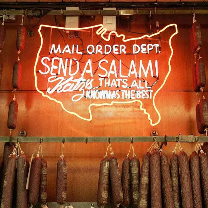
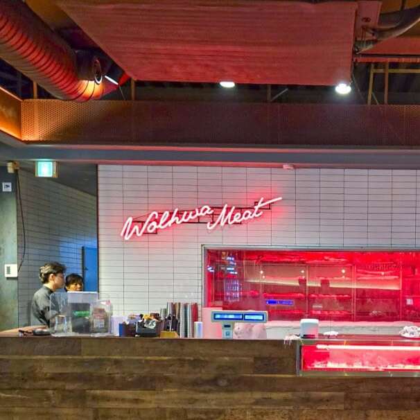
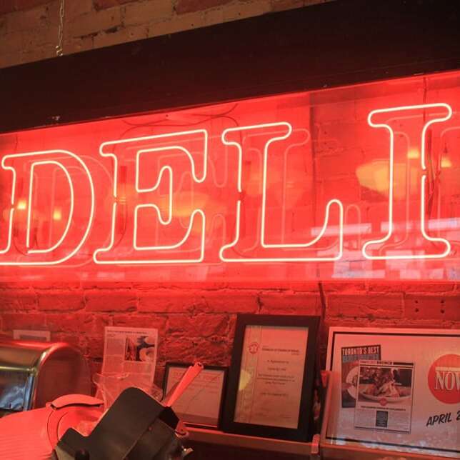
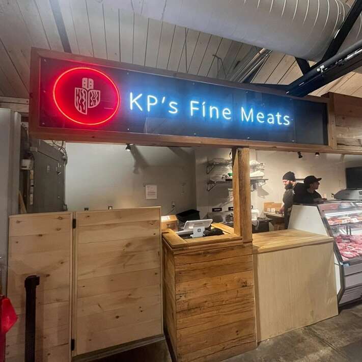
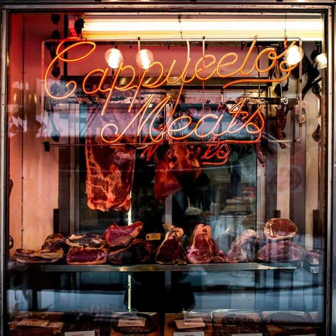
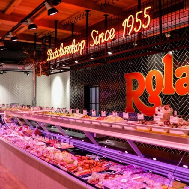
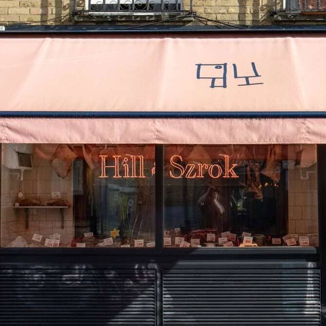
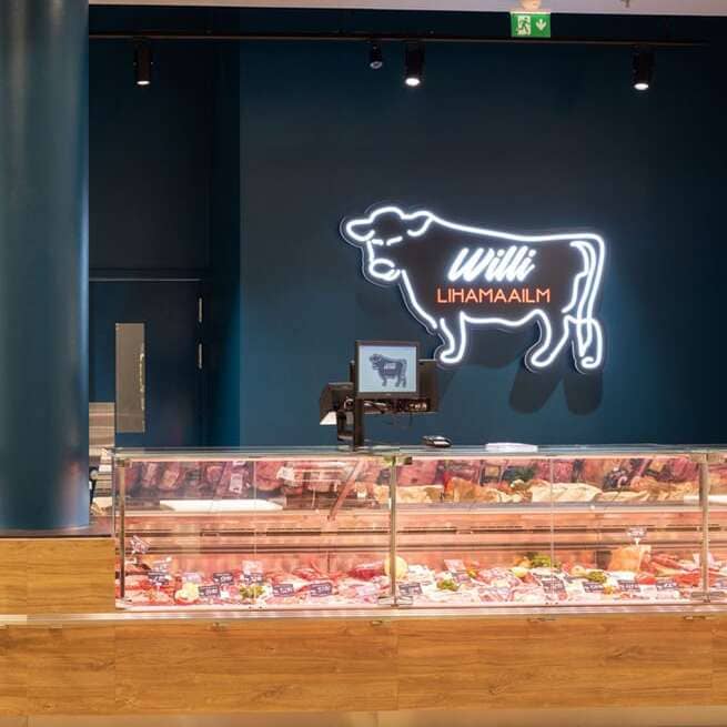
A butcher shop, deli, or specialty market already has plenty for customers to look at. There may be a refrigerated meat case across one wall, a sandwich menu above the counter, shelves of packaged food, handwritten specials, scales, cutting equipment, and staff working behind the counter. A neon sign works best when it gives all of that activity a clear brand anchor instead of becoming one more thing competing for attention.
The right sign also depends on what kind of business people are walking into. An old neighborhood butcher shop can lean into tradition. A modern deli may need something clean enough to sit beside a large digital menu. A specialty market carrying imported cheese, wine, prepared food, and groceries may be better served by its name or logo than by a literal meat or sandwich graphic. The business should decide the sign, not the category.

White tube Colored tube
Your Idea, Made into Neon
Share your idea
Upload your logo, artwork, or inspiration, and tell us your preferred size, colors, and any deadline. No finished design? Describe your idea, and we’ll help bring it to life.
Get your free mockup
We’ll send you a free design mockup and quote within 24 hours. Our team will help you refine the details until you’re happy with your design.
Approve & we’ll create
Once you approve the design and complete payment, we’ll start making your custom LED neon sign. Most signs are ready to ship in about one week.
Delivered to your door
Enjoy free shipping worldwide. Your sign will be carefully packed to protect it in transit, ready to brighten your space.
Create a Custom Neon Sign
 Learn moreDots will be represented as short lines.
Font
Learn moreRGB Color is Not Available for Egypienne font.Color -
White tube when off
Colored tube when off
Select each letter to customize its colorMulti Color
 True Color
Size (Height of each line):
The sign width will be proportional to the chosen font and word spacingW×H(approx.):0.00cm × 0.00cm0.00in × 0.00in

Free 3M Command Strips
For best results, we recommend using at least one pair of Command Strips per foot of width.
Free Standard Screws
Production Time: 1-2 weeks

Your Idea, Crafted in Glass Neon
Share your idea
Upload your logo, artwork, or inspiration, and tell us your preferred size, colors, and any deadline. We’ll help adapt your idea to the shapes and curves of real glass neon.
Get your free mockup
We’ll send you a free design mockup and quote within 24 hours, with guidance on sizing, colors, and any adjustments needed for hand-bent glass tubing.
Approve & we’ll handcraft
Once you approve the design and complete payment, we’ll begin handcrafting your glass neon sign. Glass neon takes longer to make than LED neon, and we’ll confirm the estimated production time before you order.
Carefully packed & delivered
Enjoy free shipping worldwide. Your glass neon sign will be carefully wrapped in protective materials and secured in a sturdy corrugated cardboard box or wooden crate to protect it during transit.
Create Your Own Vintage Glass Neon Sign
- Learn moreDots will be represented as short lines.
Font
Color -
White tube when off
Colored tube when off
Size (Height of each line):
The sign width will be proportional to the chosen font and word spacingW×H(approx.):0.00cm × 0.00cm0.00in × 0.00in
Backboard:
Choose Cable Color:
Production Time: 2-3 weeks

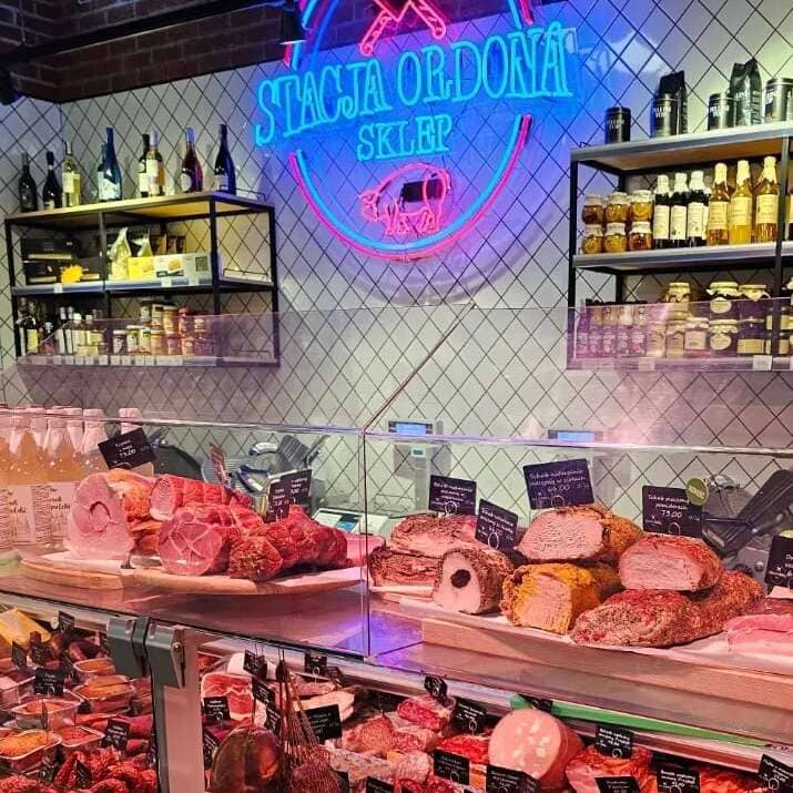
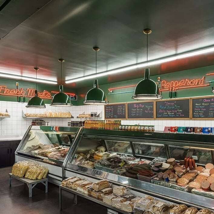
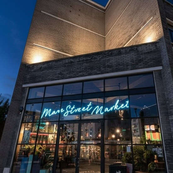
Let the Food Case Do Its Job
The refrigerated display case is usually the most important thing in a butcher shop. Customers look down to compare steaks, sausages, chops, prepared foods, cheeses, or deli meats, then look up to speak with the person behind the counter. The sign does not need to sit directly above every product to be noticed.
A good location is often the wall behind the service counter, where customers can see the business name while they wait without the sign blocking menu boards or competing with the case. If the store has a long counter, the sign can help visually anchor one end of it while the menu and food remain the focus in the center.
Lighting matters here because fresh food is judged heavily by color. Strong red, blue, or purple light close to a refrigerated case can change how meat, cheese, bread, or prepared food looks to the eye and in customer photos. If accurate food color matters at the counter, keep the main case lighting neutral and give the neon enough distance that its glow stays on the wall instead of washing over the product.
Storefront Signs That Explain the Business
Many independent butcher shops and delis have names that do not immediately tell a new customer what is inside. A family surname may be memorable once people know the store, but someone walking past for the first time may still need a simple cue such as BUTCHER, DELI, MARKET, MEATS, or SANDWICHES.
That does not mean filling the front window with five illuminated messages. A store name or logo plus one clear category cue is usually enough. The sign also has to work with whatever is already in the window: opening hours, health department notices, printed specials, catering information, and product displays. Our storefront neon sign guide goes deeper into window placement and the difference between a sign that looks bright at night and one that still reads during the day.
For a business with a recognizable mark, a custom logo neon sign can be stronger than adding more descriptive words. The logo should remain simple enough to read from the customer side of the counter or through the front window rather than trying to reproduce every small detail from a printed label.
Branding Behind the Service Counter
A service-counter business has something many retailers do not: customers regularly stand in one place and wait. They may be waiting for meat to be cut, a sandwich to be made, an order to be wrapped, or a number to be called. That makes the wall behind the counter valuable.
A business name, short tagline, established year, or simple brand phrase works well there because customers have time to see it. A deli with a busy lunch rush can also use a permanent sign to define the pickup end of the counter, although changing operational information is better kept on a menu board or replaceable sign. If online ordering procedures change next year, you do not want a permanent neon sign tied to an old workflow.
Delis with substantial prepared-food or dining operations overlap with many of the same concerns as a restaurant. The restaurant neon sign page is useful when the business includes tables, a larger menu, or a separate dining area.
A Butcher, a Deli, and a Market Should Look Different
A traditional butcher shop can comfortably use imagery such as a steer outline, cleaver, butcher knife, or the word BUTCHER, especially when the rest of the shop already uses wood, tile, vintage lettering, or old market references. The sign feels natural because it continues an identity that is already there.
A deli is usually busier visually. Menu boards, sandwich photos, drink coolers, chips, condiments, and pickup shelves can fill the customer’s view quickly. A simpler store name or logo generally works better than another detailed illustration.
Specialty markets have the widest range. An Italian market, gourmet grocery, cheese shop, seafood market, or neighborhood provisions store may have little reason to use a stereotypical butcher motif at all. The sign should follow the actual business customers are walking into. A logo, family name, neighborhood reference, or established year may say much more about the store than a generic food icon.
Separate Permanent Branding From Changing Specials
Prices change. Cuts sell out. Sandwiches come and go. Seasonal products appear for a few weeks and disappear. Those things belong on boards, printed cards, screens, or other signs that are easy to update.
Permanent neon is better for information that should still make sense several years from now: the business name, logo, category, or a phrase closely tied to the brand. “Fresh Cuts Daily” may work for a butcher shop built around that message. “$9.99 Lunch Special” obviously does not.
This also keeps the room easier to read. Customers should be able to glance up and know where the brand is, then look to the menu or case for today’s choices without both pieces of information fighting for the same attention.
Modern LED or Vintage Glass
Most modern butcher shops, delis, and markets are well suited to LED neon. It is lighter and easier to place behind a counter or on a finished retail wall, and the broader color selection makes it easier to match an existing brand. If that fits the store, you can design a custom LED neon sign around the business name, a short phrase, or a simple graphic.
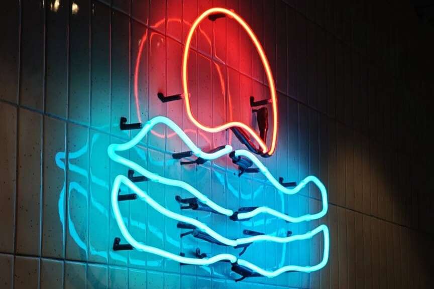
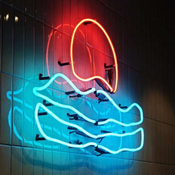
Traditional glass is more specific. It makes the most sense in a shop that is deliberately building an old market, vintage grocery, classic New York deli, or heritage butcher aesthetic. Hand-bent tubing can look at home beside subway tile, painted signage, dark wood, and decades-old brand references. For that kind of space, a custom vintage neon sign may feel more believable than trying to make a modern shop look artificially old.
Neither material can create the theme by itself. If everything else in the store is new, bright, and minimal, adding one vintage-looking sign does not automatically turn it into a heritage market.
Keep Signs Out of Prep Areas
The cutting table, slicer, sink, hand-washing station, food-prep counter, and equipment-cleaning area are poor places for decorative signage. Staff need room to work, and those are also the places most likely to see water, grease, cleaning spray, or frequent wiping.
A wall behind the customer-facing counter is different from the prep wall directly behind a cutting block. The first is part of the retail space; the second is part of the work area. Keeping the sign in the retail side of that boundary makes both installation and cleaning easier.
Cords should also stay clear of knife work, rolling racks, refrigerators, and anything staff moves during cleaning. Plan the outlet and cable route before choosing the final wall position instead of mounting the sign first and discovering that the cord has to cross a working surface.
Sizing for Counters and Retail Walls
An empty wall can make a sign look smaller than it will once the room is operating. Judge the size while looking at the display case, menu boards, shelves, doorway, and counter together.
Echo Neon custom text signs are available in 8.5, 10, 11.5, 13, and 14.5-inch letter heights, with overall length determined by the wording and font. A short BUTCHER sign at a larger letter height can still be relatively compact, while a long family business name can become wide quickly. The neon sign size guide is useful for comparing text height with actual wall space.
For a counter sign, readability from the entrance or waiting line matters more than filling the entire wall. Put painter’s tape on the wall at the proposed dimensions and look at it from where a customer actually stands before committing.
Cleaning Around Food Service
A food business gets cleaned often, which is good, but the products used on counters and floors should not automatically be used on the sign. Strong degreasers, alcohol, ammonia-based glass cleaner, bleach, and solvents can damage acrylic.
Unplug the sign first. Dust it with a microfiber cloth or soft brush, then use a barely damp cloth with mild dish soap and plain or distilled water when needed. Do not spray cleaner directly onto the acrylic or electrical connections. The full neon sign maintenance guide covers routine cleaning in more detail.
Frequently Asked Questions
A business name or logo is usually the strongest choice because it stays relevant even when products, prices, and menus change. Keep it high enough that staff, equipment, and customers waiting at the counter do not block it.
Yes, provided the wall and electrical location work, but keep enough distance that colored light does not heavily wash over the food. Neutral case lighting should remain responsible for showing customers the true color of meat, cheese, bread, and prepared foods.
Only if it fits the store. Those graphics can work very well for a traditional butcher shop, but a modern deli, gourmet market, or specialty grocery may look better with its name, logo, or a simple category word.
It can be. A shop already built around vintage tile, traditional lettering, dark wood, or an old-market atmosphere is one of the commercial settings where traditional glass neon can feel natural. For a modern store, LED is usually the more practical choice.
Avoid cutting stations, sinks, food-prep counters, equipment-washing areas, and places where carts, refrigerator doors, racks, or staff regularly make contact with the wall. A customer-facing wall behind or beside the counter is generally a better location.
Often one strong sign is enough. A second can make sense when the storefront and interior counter serve clearly different jobs, but adding signs to every wall usually makes an already busy food-retail space harder to read.