


A black neon background creates bold, modern, and eye-catching visuals for signs, digital graphics, websites, and interior decor. When done well, neon on black balances bright glow with clear readability for any viewer. This guide covers simple, practical design rules to make your dark neon background look professional and easy to read in any setting.
What Is a Black Neon Background?
A black neon background uses a solid black or near-black surface as the base for bright neon colors, glow effects, text, or shapes. It works for physical neon signs, digital banners, social media graphics, website dark mode, wall art, and brand materials. The dark backdrop makes neon hues stand out without extra noise or distraction.
Many designers choose a black neon background because it enhances brightness, creates strong contrast, and supports a futuristic, retro, or minimalist style. Whether you are making a custom sign, a website header, or a room decoration, starting with the right base ensures your final design is both attractive and readable.
Why Neon on Black Is a Powerful Design Choice
Neon on black delivers consistent visual impact for both casual and professional projects. Here are the key benefits:
- Strong contrast that improves visibility day and night
- Timeless style that fits retro, cyberpunk, minimalist, and modern themes
- Reduced visual clutter so viewers focus on your message
- Versatility for physical signs, digital screens, and interior design
- Better eye comfort compared to bright backgrounds with dark text
Using a dark neon background also helps neon glows spread evenly without washing out. This balance makes your design feel polished, not messy or overwhelming.
Core Design Rules for Black Neon Backgrounds
Follow these straightforward rules to create clean, readable, and professional neon on black designs.
1. Start with the Right Black Base
Not all black backgrounds perform the same with neon. For best results:
- Use solid black or dark charcoal gray (#121212 to #1E1E1E) instead of pure black for digital designs
- Avoid textured or busy black backgrounds that compete with the neon glow
- For physical signs, choose matte or smooth black acrylic to reduce glare
- Keep the background uniform to maintain readability from a distance
A clean base ensures your neon text or shapes remain the main focus. This is one of the most important rules for a high-quality black neon background.

2. Control Contrast for Readability
Contrast makes neon readable on black. Too little contrast makes text fade; too much causes eye strain.
- Aim for a contrast ratio that meets modern accessibility standards
- Use one dominant neon color to keep contrast consistent
- Avoid mixing too many bright neon shades on one black background
- Test your design in dim light and bright light to confirm readability
Well-managed contrast ensures people can read your message quickly, whether they are near or far.
3. Choose Neon Colors That Pop on Black
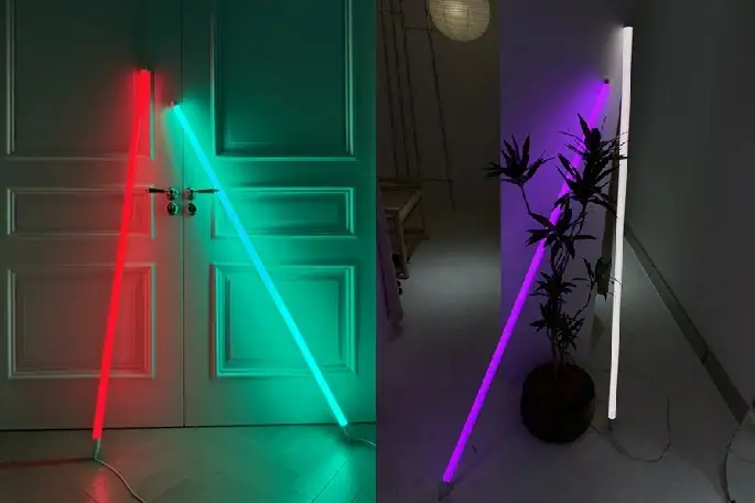
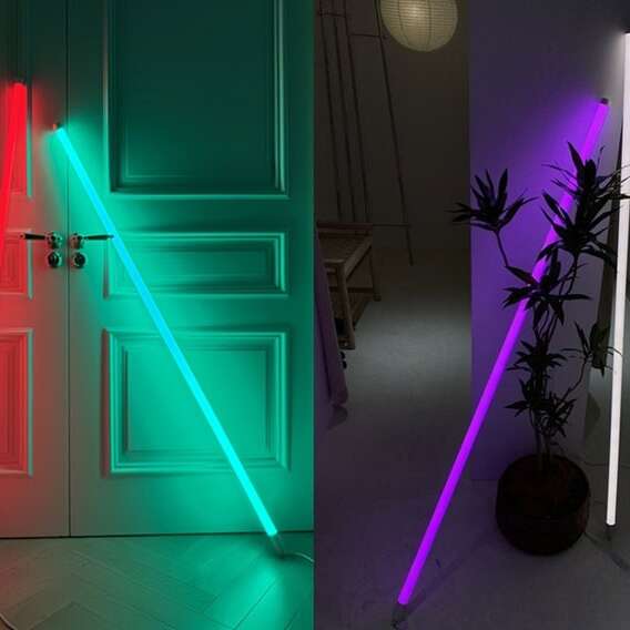
Some neon colors perform better than others on a dark neon background. The most reliable choices include:
- Hot pink and bright magenta
- Electric blue and cyan
- Lime green and electric yellow
- Bold red and purple
Stick to one or two main neon colors. Using too many creates visual chaos and lowers readability. For bold pink ideas, explore the neon pink aesthetic to see how hot pink works in decor and signs. For cooler, fresh color combinations, visit green neon shades for pairing tips and room ideas.

4. Font Choice: Clear Over Fancy
Readability depends heavily on font selection. For neon on black:
- Use bold, wide sans-serif fonts for maximum clarity
- Avoid thin, script, or highly decorative fonts for long text
- Choose rounded letterforms to mimic the real neon tube shape
- Increase letter spacing so glows do not blend into one messy block
For physical neon signs, blocky fonts remain readable from a much greater distance. For digital designs, clean fonts prevent the neon effect from becoming unreadable.
5. Glow Effect Settings: Soft, Not Overpowering
The glow is what makes neon special—but too much glow ruins readability.
- Use a soft, subtle glow instead of a heavy blur
- Keep the glow spread consistent across all text and shapes
- Avoid overlapping glows that merge letters or graphics
- Reduce glow intensity for small text
A controlled glow keeps your design looking professional without sacrificing clarity. This rule applies to both digital neon effects and physical neon sign layouts.
6. Spacing and Layout: Give Neon Room to Shine
Crowded designs become unreadable fast. Follow these layout tips:
- Leave an empty black space between text lines and graphic elements
- Align text neatly—left alignment is often easiest to read
- Place important words or symbols in the center or top area
- Keep lines short for signs and headers
Good spacing ensures your neon on black design feels balanced, calm, and easy to absorb at a glance. If you want to customize your own sign, there are some professional neon sign brands, such as Echo Neon.
7. Scale and Viewing Distance
Your design must match how far people will stand from it.
- For close viewing (websites, phones, small signs): use medium neon size and moderate glow
- For far viewing (store signs, wall art, event displays): use larger text and bolder lines
- Test readability by stepping back or viewing your digital design at actual size
A strong black neon background works at any distance when scaled correctly.
Common Mistakes That Hurt Readability
Avoid these simple errors to keep your neon on black design clear and professional:
- Using too many neon colors at once
- Choosing thin, fancy fonts that blur in a glow
- Making letters too tight or crowded
- Using a busy, textured black background
- Making the glow effects too strong or uneven
- Forgetting to test in different lighting
Correcting these mistakes immediately enhances readability and gives your design a more polished appearance.
How to Apply Black Neon Background Rules to Different Projects
These rules work across every type of neon design. Below are quick tips for common uses.
Neon Signs and Wall Decor
Physical neon signs rely on clean layout and strong contrast.
- Use solid black backing for consistent color pop
- Choose bold fonts for names, quotes, or short phrases
- Limit each sign to one or two neon colors
- Use spacing to keep letters from merging when lit
For a more artistic approach, read neon wall art to learn how this style works in decorative displays.
Website Dark Mode and Digital Graphics
For websites, banners, and social media:
- Use dark gray instead of pure black to reduce eye strain
- Keep neon accents small for buttons, headers, or highlights
- Test contrast on phone, laptop, and desktop screens
- Use neon for emphasis, not for full paragraphs
A well-crafted dark neon background improves user experience and makes your digital content more memorable.
Branding and Logo Design
Neon on black strengthens brand identity when used carefully.
- Use your brand’s main neon color on a clean black base
- Keep logos simple, bold, and uncluttered
- Avoid excessive glow that distorts your logo shape
- Use the same black tone across all brand materials
Consistent application builds recognition and makes your brand feel modern and professional.

Step-by-Step Quick Workflow for Neon on Black
You can create a readable black neon background in minutes with this simple process:
- 1. Set a solid black or dark charcoal base
- 2. Select one main neon color and one optional accent
- 3. Choose a bold, clear font with extra letter spacing
- 4. Add soft, subtle glow effects
- 5. Arrange elements with plenty of empty black space
- 6. Test readability in bright and dim light
- 7. Adjust contrast, glow, or spacing if needed
This workflow is suitable for both beginners and experienced designers alike.
Frequently Asked Questions About Black Neon Backgrounds
What is the best black tone to pair with neon backgrounds?
Dark charcoal gray (#121212 to #1E1E1E) is the best choice for digital designs. Solid black matte acrylic is ideal for physical neon signs. Both support strong contrast and reduce glare.
How many neon colors should I use on a black background?
Stick to one or two neon colors. More than that creates clutter and reduces readability. One dominant color keeps your design focused and balanced.
What fonts are most readable for neon on black?
Bold, wide sans-serif fonts are most reliable. Avoid thin scripts or highly stylized fonts, especially for long text or signs viewed from a distance.
How can I create a neon glow without compromising readability?
Use a soft, small glow instead of a heavy blur. Keep letters spaced apart so glows do not merge. Test your design at different sizes to ensure clarity.
Can I use a black neon background for my website?
Yes. A dark neon background works beautifully for website headers, buttons, dark mode, and accent graphics. Keep neon elements minimal to maintain readability for longer text.

Start Creating Perfect Neon on Black Designs
Using a black neon background effectively helps you create signs, graphics, and decor that are both visually appealing and easy to read. By following simple rules for contrast, color, spacing, and glow, you can consistently achieve strong, professional results.
A clean, dark neon background makes your neon colors stand out without causing eye strain or messy visuals. Whether you are working on physical signs, digital graphics, or interior design, neon on black remains one of the most timeless and effective styles available.
With the guidelines in this guide, you now have everything you need to build clear, balanced, and eye‑catching neon designs for any project.